
How NOT To Learn Color Theory
An Idiot's Guide to Beginner Color Theory.

Color Mixing
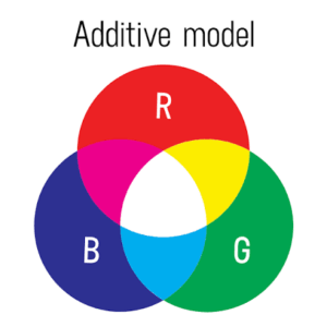
Color mixing is the process of combining two or more colors to create new colors. By understanding how colors interact, you can create a wide variety of shades, tints, tones, and hues for artwork, design, and painting.
RGB are usually used on screens whereas CMYK are used for printing.
Properties of Color: Hue, Value, & Saturation
Hue
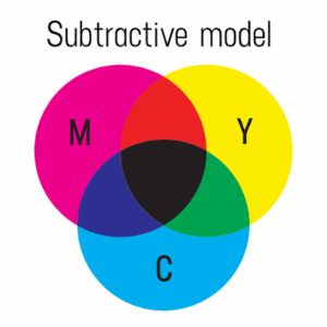
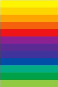
Hue: The actual color you see — like red, blue, green, or yellow. It tells you what color it is.
Saturation
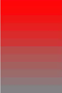
Saturation (S): How strong or pure the color is.
High saturation = bright, vivid color
Low saturation = dull, grayish color

Value
Value (V): How light or dark the color is.
High value = lighter color
Low value = darker color
Color Wheel
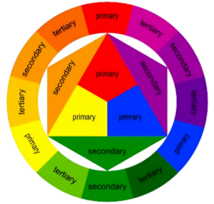
The most common organization for the relationship of the basic colors is the 12 step color wheel. (It comes from the early 18th c.) It includes 3 primary colors, 3 secondary colors and 6 tertiary colors
Color Harmony
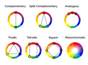
Color harmony is the combination of colors that creates a balanced and visually pleasing design. Different color schemes can change the mood, contrast, and overall appearance of artwork or designs.
Complimentary
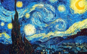
Complementary colors are pairs of hues situated directly opposite each other on the color wheel.
The Starry Night — Vincent van Gogh (1889)
Split-complimentary
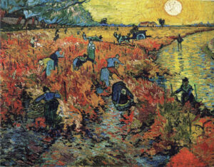
A split-complementary color scheme
The Red Vineyard — Vincent van Gogh (1888)
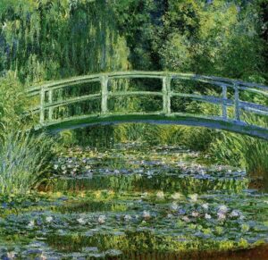
Analogous
An analogous color harmony uses 3 to 5 colors that sit directly next to each other on the color wheel.
Claude Monet, The Japanese Bridge (The Water Lilly Pond), 1899
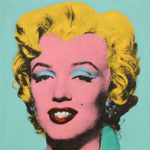
Triadic
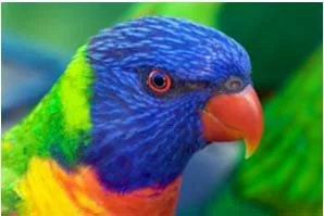
Tetradic
Tetradic color harmony is a rich and vibrant design scheme that uses four colors formed by two pairs of complementary colors.
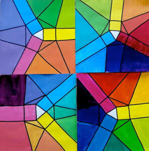
Square
A square color harmony is a four-color palette based on a variant of tetradic color theory, featuring hues spaced equally apart at 90-degree intervals around the color wheel.
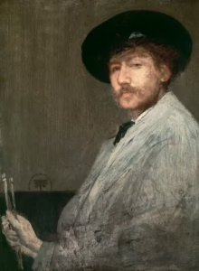
Monochromatic
Monochromatic color harmony utilizes a single base hue, expanding it into various shades, tints, and tones by adding varying amounts of black, white, or gray.
Arrangement in Gray: Portrait of the Painter (c. 1872) by James McNeill Whistler